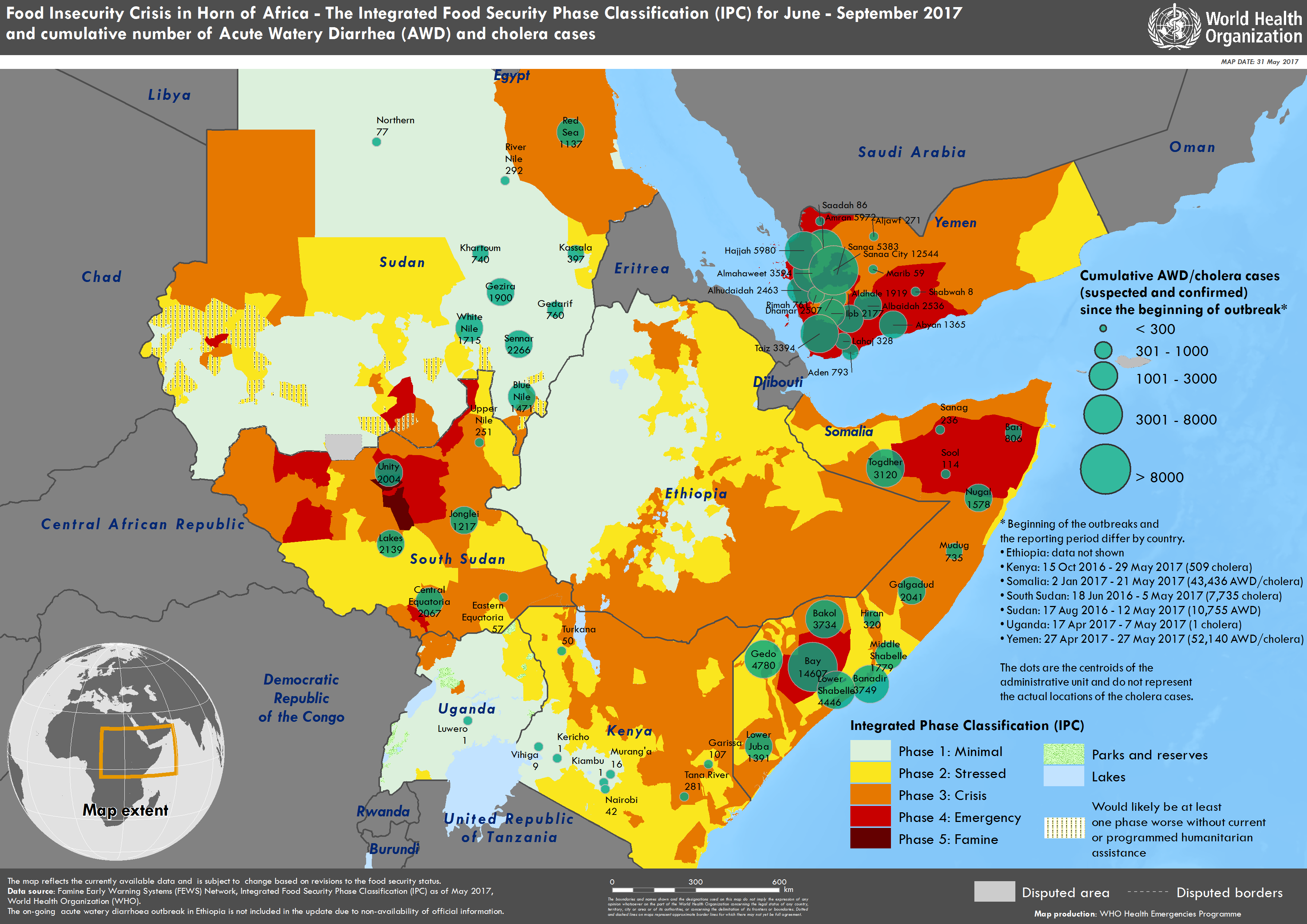
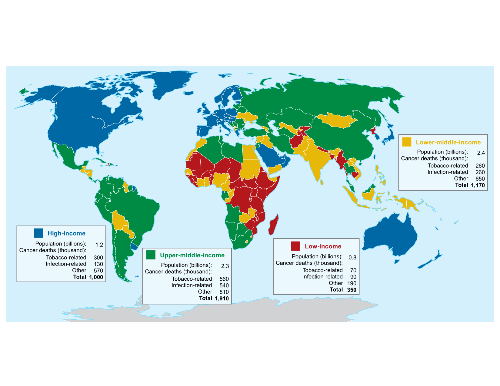
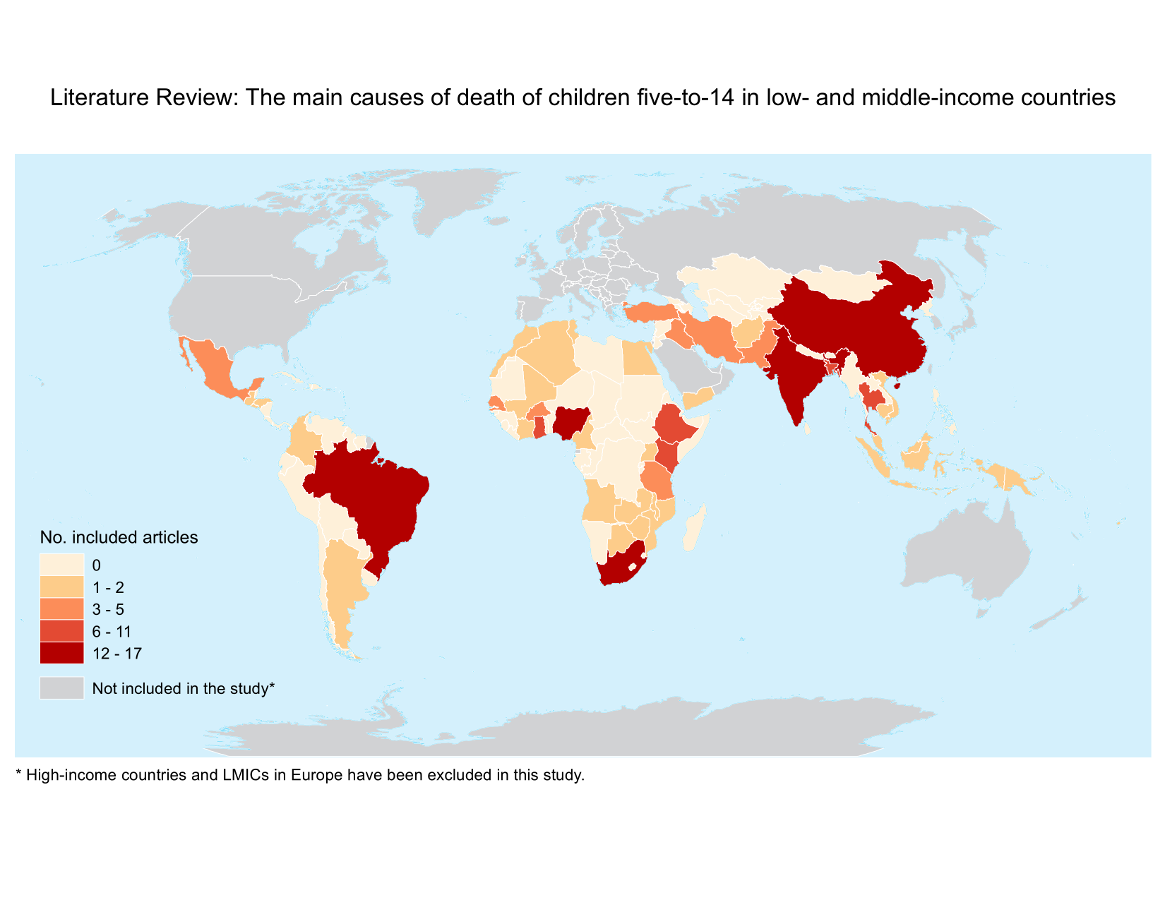
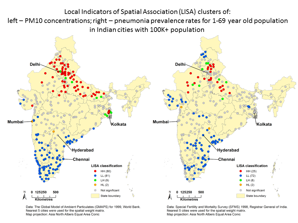
<<<<<<< HEAD ======= >>>>>>> origin/gh-pages

Hi I'm Yurie.

This is my website where I share my work related contents :)! I earned my bachelor’s degree in Social Geography from Yokohama City University in Japan and my master’s degree in Spatial Analysis with a main focus on epidemiology from Ryerson University (MSA) in Toronto.

Learn about what I do

Here's all the stuff I do.

Data management

  • - Tabular and spatial data manipulation
  • - Software include:
  • MS SQL Server, MS Access, PostgreSQL, MS Excel, Python, Visual Basic

Data analysis

  • - Geospatial and statistical analysis
  • - Software include:
  • ArcGIS, PostGIS, R, SPSS, GeoDa, SaTScan

Mapping / visualization

  • - Data visualization experience using retail, environmental, and epidemiological data
  • - Software include:
  • ArcGIS, QGIS, R, MapInfo, MS PowerPoint

Here are some maps that I made in the past.

Please feel free to take a look!

Horn of Africa - Food insecurity crisis

A series of maps created during the Horn of Africa - Food insecurity crisis in 2017. These maps show the Integrated Food Security Phase Classification (IPC) and cumulative number of acute watery diarrhea and cholera cases in the affected countries.

Global cancer mortality map

The map summarizes the number of cancer mortality by the World Bank income classification, estimated by our research team at the Centre for Global Health Research (CGHR; currently under review).

WHO systematic review - summary map

This map was created for a systematic review completed by my colleagues at CGHR to identify the major causes of death among children aged 5-14 years in low- and middle-income countries. The map was used in the summary report submitted to the World Health Organization (WHO).

Hot & cold spots of PM10air pollution and pneumonia prevalence

These maps were created for my master's thesis, in which the impact of fine particulate matter (PM10) on cardiorespiratory diseases in India was investigated. The 2 maps show the clustering results from the LISA (local indicators of spatial association) statistics.

Under-5 mortality Millennium Development Goal (MDG) progress map in India

I created this map for one of my colleagues at CGHR who was analyzing the MDG progress in under-5 child mortality in Indian urban agglomeration areas. We had three major pieces of information to display on the map, which was a bit challenging. I was able to work this around by changing the symbol size and the label formatting. A JavaScript code was used to generate the data-driven map labels. I also made sure that smaller circles would lie on top bigger circles wherever they overlap.

Geodemographic final cluster map

I made this map for my final project of the Geodemographic course. K-means cluster analysis was used to group together census tracts with similar characteristics in terms of socio-economic statuses, ethnicity, family structure, and life styles etc to generate the geodemographic clusters. These clusters can be useful for both business sectors and public policy makers to identify where their targeted population groups are! Details of some of the demographic clusters can be found here.

Muslim clusters in India

There are many epidemiological studies indicating associations bewteen certain health outcomes and religions (i.e. lower cervical/breast cancer screening rates among Muslims). I downloaded Indian Census data to analyze spatial clustering of different religions in the country.

GO train station long/lat extraction VBA

The file contains a Visual Basic script that I wrote to extract the XY coordinates (long/lat) of GO train stations from wikipedia pages for my remote sensing project. When you open the file, please chose "Enable Editing" at the top, then click the "Get XY coordinates" button to test the script.

Bell store trade area analysis

This map was created when I was part of the Bell Mobility internship program. The map displays the trade areas of the 3 bell stores located in the CMA Guelph, which were generated based on the thiessen polygon method in ArcGIS. The CT-level average household income, road network, as well as the locations of other retail stores are also displayed.

Potential advertisement locations at Dixie Outlet Mall

Another map created during my time at Bell Mobility internship program. The map was created based on the mall floor plan as well as the billboard location data which we collected in the field using a portable GPS device. To visualize the optimal lolcation of the company's advertisements, we measured the approximate viewable areas for each of the billboard within/outside the mall. (Yes, it was a lot of work!)

Land cover change detection

This was part of my remote sensing assignment, where I looked at land cover changes within 5km catchment areas of different GO train stations using Landsat imagery. I used ENVI to select the training set and run supervised maximum likelihood classification.

Finally, I enjoy travelling for whatever purposes!

The map below shows all the places I have been in my life.
This map was produced using R Shiny, Leaflet, and the Stamen Watercolor map as a basemap.

Please feel free to contact :)


Find me on ...